 Best Stock Hints Latest Tips To Buy & Invest Best Stocks Today

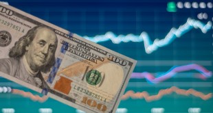
Technology Sector Overview for 2019
The new year has arrived and, for many, this marks a fresh start. This is especially true for money managers. I am sure many of them are looking forward to a new beginning because 2018 did not exactly shape up to be a banner year for the tech sector.
Since early October 2018, the markets began to sell off, and the selling has been relentless. December, which is usually a good month for stocks and is known for the “Santa Claus rally,” was on pace to be the worst-performing December since the Great Depression.
Just the mention of the Great Depression sends chills down my spine, but what else can we expect when the Federal Reserve continues to raise interest rates and a trade war continues to escalate?
Any historian will tell you that these are the exact same factors that fueled the economic contraction that led to the Great Depression. Add the government shutdown into the equation and it becomes quite obvious why the markets have been performing as poorly as they currently are.
Technology Industry Trends in 2019
Facebook, Inc. (NASDAQ:FB), Apple Inc. (NASDAQ:AAPL), Amazon.com, Inc. (NASDAQ:AMZN), Netflix, Inc. (NASDAQ:NFLX), and Google-parent Alphabet Inc (NASDAQ:GOOG) are the famous “FAANG” stocks that the bull market in technology stocks has been built on.
Unfortunately, these stocks have all rolled over recently, putting the tech sector in a precarious position. So if you think the current market is difficult, then I am sorry to say that I do not think things are going to get any easier this year.
In order for you to get a better grasp of what I’m trying to point out, here’s my technology sector overview for 2019. I am going to take a technical approach, outlining the developments that have inflicted the FAANG stocks and the implications of these developments.
The Facebook stock chart below captures a bullish trend that began in June 2013 at $22.57 and traveled to a high of $218.62. It displays the staircase price action that bullish trends are so famous for.
In case you’re wondering, this bullish trend captured an 864.4% gain from trough to peak.

Chart courtesy of StockCharts.com
The uptrend line on the chart above was created by connecting a series of higher lows that created a stair-step price action. This uptrend line is a simple tool, capturing a bullish trend by pinpointing where significant levels of price support reside.
Using the uptrend line is just as simple as it was to create. As long as the stock price is trading north of this metric, one can only assume that a bull market is in development and that, as a result, higher stock prices should prevail over time.
Breaking below the uptrend line, on the other hand, would negate any and all bullish implications, suggesting that the trend toward higher prices has come to an end.
On October 8, 2018, Facebook stock broke below the uptrend line. This event is highlighted on the chart above as a breakdown. The breakdown is suggesting that the bullish trend that began in 2013 is no longer in development and that a bearish trend has taken its place.
Apple
The Apple stock chart below captures a bullish trend that began in 2009, in the aftermath of the financial crisis. The stair-step price action that created this bullish trend was responsible for taking Apple stock from low of $11.76 in March 2009 to a high of $233.47 in October 2018, representing a 1,885% return in 10 years.

Chart courtesy of StockCharts.com
The moving average convergence/divergence (MACD) indicator in the lower panel of the chart above has had an impeccable track record of indicating when AAPL stock was set to advance or correct.
MACD is a simple yet effective momentum indicator that uses the crossing of a signal line to determine whether bullish or bearish momentum is influencing the price action in a stock. This is key information because a stock cannot sustain a move in either direction unless the applicable level of momentum is supporting it.
The chart above clearly illustrates that when the MACD indicator was in bullish alignment, Apple stock staged an advance. When it was in bearish alignment, the stock suffered a correction. This proves my point that a sustained move in either direction needs to be accompanied by the applicable level of momentum.
In early December, the MACD indicator swung into bearish alignment, suggesting that a correction was now in development. These signals tend to last months, sometimes years, suggesting that Apple stock is only in the early innings of a correction.
Amazon
The Amazon stock chart below captures a bullish trend that began in January 2015, when the stock was trading at $285.25. Over the course of three-and-a-half years, the stock appreciated to the tune of 618.9% before it peaked at $2,050.

Chart courtesy of StockCharts.com
The entire time this bullish move was in development, the MACD indicator was in bullish alignment, supporting the notion that higher stock prices were likely.
This proves my point once again that momentum paves the path of least resistance and that without the applicable level of momentum, a sustained move in any direction is unlikely to occur.
The MACD indicator has now swung into bearish alignment, generating a bearish monthly signal, suggesting that momentum is now paving a path of least resistance toward lower prices.
This event strongly suggests that the tide has shifted and that Amazon has only begun a move toward lower prices. Monthly signals tend to linger for many months—and sometimes years.
Going forward, as a result of this bearish signal, Amazon stock is prone to downward price shocks.
Netflix
The Netflix stock chart below captures the bullish trend responsible for taking the stock from a low of $97.63 in October 2016 to a high of $423.21 in June 2018.

Chart courtesy of StockCharts.com
This bullish trend was captured using an uptrend line and—like with many of NFLX stock’s peers—this uptrend line pinpointed where significant levels of price support resided.
While this bullish trend was in development, the MACD indicator was in bullish alignment, indicating that bullish momentum was paving a path of least resistance toward higher prices.
This is why, whenever the uptrend line was tested, investors were eager to jump in and support Netflix at these levels.
In November 2018, Netflix broke below the uptrend line and generated a bearish MACD signal.
These signals are simultaneously suggesting that the bullish trend that began in October 2016 (which was supported by bullish momentum), has come to an end and that bearish momentum is now paving a path of least resistance toward lower Netflix stock prices.
Once again, the MACD signal, which was generated on a monthly scale, is suggesting that bearish momentum is likely to pressure NFLX stock prices lower for many months to come.
Google (Alphabet)
The Alphabet stock chart below captures one of the most immaculate bullish trends I have ever come across.

Chart courtesy of StockCharts.com
This bullish trend began in August 2004, and higher highs and higher lows have prevailed ever since.
The uptrend line was created by connecting the sequence of higher lows. For one-and-a-half decades, this simple metric acted as a significant level of price support.
Every time it was tested, the stock price quickly found support and higher prices prevailed over time.
As the bullish trend began to age, the frequency of tests of this uptrend line began to increase, but investors continued to support it.
The stock’s inability to trade below this uptrend line is why I also used this metric to gauge the general health of the stock market. I knew that as long as Google stock was in a bullish trend, the health of the stock market was in check.
Unfortunately, Google stock broke below the uptrend line in October 2018. This event suggested that the bullish trend that began in August 2004 had finally run its course, opening the door for a correction and a bearish trend.
Given the significance I assigned to this uptrend line, the break below it also suggested that the health of the stock market had come into question. It indicated that not only was Google stock likely to correct, but the entire stock market was at risk for a correction.
Recent events have reaffirmed these beliefs.
Tech Stock Forecast for 2019
All the FAANG stocks I have highlighted on the charts above are broken from a technical perspective. Investors who are looking for the tech stock forecast for 2019 might be a bit discouraged because these technical developments do not bode well for the tech sector index.
Given the weight of these stocks and the developments that have occurred, I can only assume that we are just in the beginning of a broad market correction. 2019 is setting up to be a difficult year for investors.
I am watching a key level of price support on the Nasdaq Composite index. The Nasdaq Composite is the proxy for the tech sector index because it is so heavily weighted toward technology stocks.
The level of price support I am watching is highlighted on the following Nasdaq Composite stock chart.

Chart courtesy of StockCharts.com
I am currently watching a level of price support that resides around 5,200. To put things into perspective, this level of price support is 21% below the current levels.
This level I am watching is significant; it was first established in March 2000 during the peak of the infamous dotcom bubble. After this level was established, the bubble burst and a vicious bear market followed.
It took 15 years to return to this level, and then the index spent the next year bumping its head on it. In December 2016, the Nasdaq Composite index finally broke above this level of price resistance and there was a spectacular move toward higher index values.
When a significant level of price resistance is broken, it has a tendency to become a significant level of price support. I believe this time is no different.
The question is, what path is the index going to take to get to this level of price support? A 20% drop is significant.
So, do I believe that the Nasdaq can crash in 2019?
My answer is yes. I would actually prefer it because the sooner we hit the bottom, the sooner we can start picking up the pieces and building a base so a bullish trend can begin again. I believe a crash is much better than the alternative, which is a drawn-out and prolonged bear market.
Analyst Take
Facebook, Amazon, Apple, Netflix, and Google, the famous FAANG stocks, have all suffered technical breakdowns.
As a result of these developments, I believe that tech stocks are likely to suffer in 2019.
Source link